We all know the old saying: Don’t judge a book by it’s cover.
In spite of this, it’s something we all find ourselves doing, especially when the unthinkable happens and our favorite series undergoes cover changes mid-way through publication.
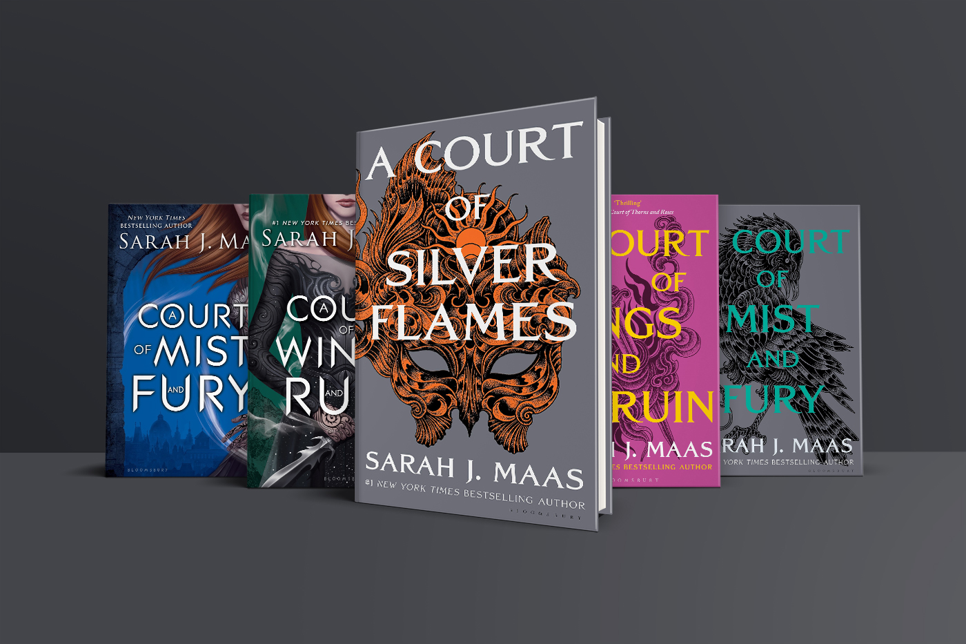
Sarah J. Maas’s immensely popular Court of Thorns and Roses series was treated to such a revamp earlier this year, swapping popular character portraits for intricate designs atop brightly colored (in some cases dull) backgrounds. The YA bookverse nearly exploded when it was revealed the cover for Maas’s upcoming book, A Court of Silver Flames, would follow suit.
But this is hardly the first time this has happened.
Related:
- New covers? A Court of Thorns and Roses is being revamped
- ‘A Court of Silver Flames’ cover revealed, some fans unhappy
A “nerve-racking” transformation
In 2016, the third novel in Samantha Shannon’s Bone Season series debuted a new look. The first two books in the series were redesigned to fit with the new direction. Like Maas’s novels, the news was met with skepticism — after all, the original covers for the series were highly regarded and book lovers have been disappointed in the past with some terrible re-designs.
“Mid-series cover changes can be nerve-racking for authors, as they’re beyond our control, and I know they can be just as nerve-racking for existing readers of a series,” Shannon noted at the time in a blog post.
“Mid-series cover changes can be nerve-racking for authors, as they’re beyond our control, and I know they can be just as nerve-racking for existing readers of a series.”
Despite the skepticism, readers worldwide breathed a sigh of relief when it came to the Bone Season covers — the reaction was fairly positive. The covers were only slightly altered, going for a fresher and cleaner design in a similar style as the originals rather than an entirely new design.
Even still, some fans were disappointed that they’d have to buy new copies of the first two books in order for the entire series to match. There was, at the very least, an effort to match the spines of the first two books so they wouldn’t look out of place on a reader’s shelf. Not all book series are so lucky.
Why make the change?
There are numerous reasons why publishers decide to redesign covers.
Sometimes it’s about money. It’s an attempt to increase sales, with the hope that fresh new covers will rejuvenate interest in a series (even self-publishers and indie authors get in on the action). Other times, there’s the hope to entice new readers from different demographics. Brandon Sanderson’s Mistborn novels were re-packaged for YA readers at one point.
Perhaps one of the most dreaded reasons for redesigning a cover is one many readers scoff at: to promote the film adaptation. Movie tie-in covers often feature movie posters as the primary art, limiting the reader’s imagination to picture the characters and understand the tone of the novel for themselves.
Overall, when books are rebranded with new covers, it’s really just a marketing tool. It’s a way for the publisher to make more money, which is what makes it problematic for many people — not everyone can afford to buy multiple copies of the same book just to have it match the new designs. Readers often feel let down when the publishers expect this of them.
When it does and doesn’t work
It is generally known now that we are likely to see cover changes for popular series once they are complete.
In 2014, new editions of the Percy Jackson series were released, as were Cassandra Clare’s The Mortal Instruments and The Infernal Devices books in 2015. In the years since the final Harry Potter book was released, there have been many re-designs to appeal to just about every available demographic.

What fans don’t mind about cover changes like this is the fact that they come after the series has been completed, and they don’t feel pressured into buying them as they already have a matching set.
Whenever redesigned covers are announced, some might often think back to one of the most jarring cover changes that we’ve seen — the Across the Universe trilogy by Beth Revis. The books underwent multiple redesigns between the first and last books being released. The first two books were released with silhouettes of the main characters against a backdrop of the universe, however, the third book was redesigned to be typography-based with the titles in front of sheets of metal. While the new covers may better fit the story, the drastic change left many fans of the series incredibly disappointed.

In contrast to this, we could look at the redesigned covers for Stephanie Perkins’ Anna and the French Kiss series, where the cover change for the final book in the series was met with overwhelming positivity when the covers went from having models as the focus point to being more typography based.
When considering cover changes like these, it’s clear to see why readers were skeptical when it came to The Bone Season’s cover changes — why it’s easy to understand the anxiety surrounding A Court of Thorns and Roses.
Readers never know what to expect. Across the Universe’s cover change was infuriating whereas Anna and the French Kiss’s was hugely positive.
In the end, surely the text within the covers is the most important thing? Because, as we all know, you shouldn’t judge a book by its cover.


Bookstacked Comment Policy
We welcome respectful comments. Our only rule is to be kind. Rude, hateful and generally mean-spirited comments will be removed.